"I am not one who was born in the custody of wisdom. I am one who is fond of olden times and intense in quest of the sacred knowing of the ancients." Gustave Courbet
Showing posts with label color. Show all posts

14 August 2021

Resonance.

Dossi, Jupiter, Mercury, and Virtue, 1524


The triple combination is mirrored at Jupiter's canvas, where three butterflies share in the process of creation. The insect under Jupiter's brush nears completion; the one to the right seems to rest on the picture's surface, whilst the uppermost butterfly is the most lively and three-dimensional. Life emerges in successive phases that are intimately linked, like frames from a film or a cartoon. In his "Allegory of Music", Dossi had used similar techniques to subdivide his theme. The history of music, from primal sound to the High Renaissance, was telescoped into a single scenario. A blow of hammer to anvil (the musical equivalent to Jupiter's painting) set creativity in train. The action is merely implied, though its after-effect is visible as a resonance of tiny notes from the anvil. The cause was evidently a rebounding hammer in Tubalcain's hand, poised to strike again. Musical sounds coalesced into a circle or triangle, as notated staves prescribing the formal progressions in time and pitch. Of course, nothing really changes in the static painting. 


If the music were heard, we might sense a kind of movement in the flow of melody through time. The Aristotelian "Problemata", printed for the first time in 1498, had puzzled over our response to music:
"Why is sound the only sensation which excites the feelings? Even melody without words has feeling. But this is not the case for colour, or smell, or taste. Is it because they have none of the motion which sound excites in us?  Now these motions stimulate action, and this action is the sign of feeling."

CONNECT 

16 May 2020

Fugitive.


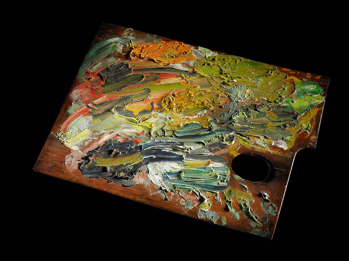
Vincent Van Gogh was obsessed with the pigments in his paints, and he knew as much or more about their composition and vulnerability as many of his contemporaries. So it is a tragic irony that many of the bright red and yellow pigments van Gogh used on his masterpieces are fading or changing color with time.

Pigment breakdown is, of course, not just a problem with van Gogh’s oeuvre: He was using many of the same pigments as other late-19th-century Northern European artists such as Pierre-Auguste Renoir or James Ensor. “You can safely say that many works from that period have probably been affected in some way by similar pigment issues,” says Ella Hendriks, senior conservator at the Van Gogh Museum, in Amsterdam.

Yet the artwork of van Gogh has become a lens through which scientists study pigment degradation. He was a prolific painter—in the 10 years he was active as an artist, van Gogh produced nearly 1,000 paintings. He was also a prolific writer: In letters to family and friends, he discussed in detail the pigments he purchased and the colors of his newly painted canvases. These written records are a valuable starting point for scientific inquiry.

As a result, van Gogh’s canvases have led to multiple discoveries about the breakdown of fragile—or what conservators call “fugitive”—pigments. What follows is a series of vignettes about how analysis of his paintings has helped illuminate chemical degradation pathways in age-old pigments and how this research informs display and conservation practices for van Gogh’s inimitable masterpieces and other artworks of his time.

CONNECT

14 April 2020

Pigment.


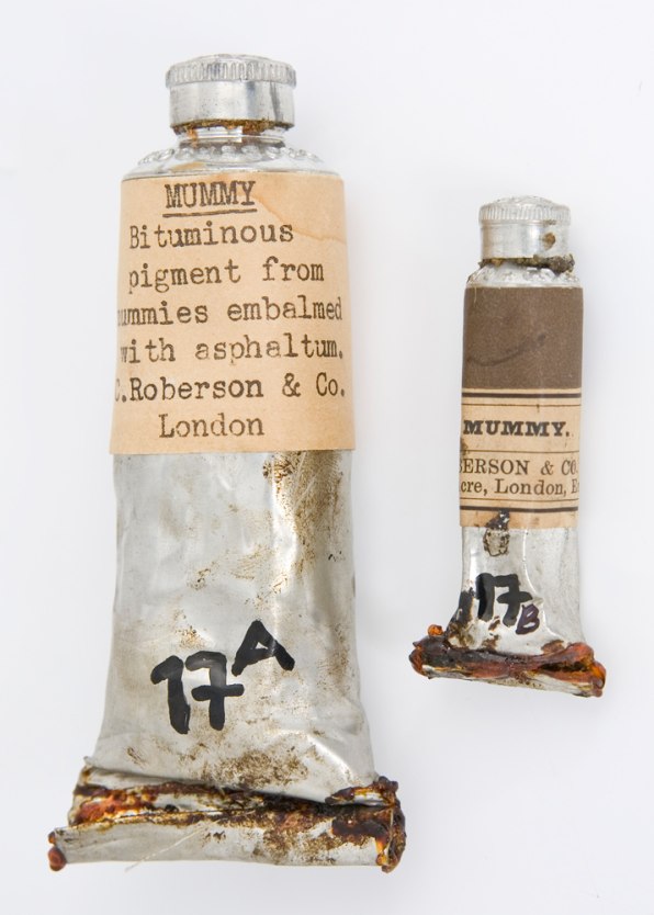
People would harvest mummies from Egypt and then extract the brown resin material that was on the wrappings . . . and turn that into a pigment.

CONNECT

21 June 2019

Lovely.


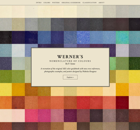
The nomenclature of colors we use today is really a machine language–numerical hex codes crafted to communicate with software on computers and printers. Before the age of CMYK and RBG, though, artists and scientists created their own languages for talking about and categorizing color. Though many have fallen into obscurity, at least one is now accessible to anyone with access to the internet: Werner’s Nomenclature of Colours.

Published in 1814 by the painter Patrick Syme based on the work of geologist Abraham Gottlob Werner, Werner’s is a working dictionary of colors found in the natural world, complete with swatches and examples of animals, minerals, and vegetables where a particular hue could be found in the wild. The book was a work straight out of the early days of natural science–Darwin traveled with a copy, and used its definitions in his writings. Compared to the precise, computerized way color is defined today, Werner’s is less than practical, yet there’s something lovely about its definitions. You could find #2, or Reddish White, on the egg of a gray linnet, for instance, or the back of Christmas rose or in porcelain soil. Auricula Purple, #41, describes the eggs of a blue bottle fly. Look for #71, Straw Yellow, on the fur of a polar bear.


Werner's Nomenclature of Colours is here.

02 April 2018

Feel.

van Gogh, Almond Blossom, 1890


In the soft, clear light of Provence, France, Vincent van Gogh saw the crisp skies of Japanese woodcut prints.  The almond blossoms, gnarled trees and irises that dotted the French landscape reminded him of nature scenes painted in Kyoto.  And in the locals who drank in cafes of Arles, he saw resonances with the geishas and Kabuki actores of a country he never visited.

“My dear brother, you know, I feel I’m in Japan,” van Gogh wrote to his brother, Theo, on March 16, 1888, not long after he had settled in Arles, an ancient city built on Roman ruins by the Rhone River in France.

By June he was urging Theo and other Impressionist artists in Paris to join him in there.  “I’d like you to spend some time here, you’d feel it,” he wrote. “After some time your vision changes, you see with a more Japanese eye, you feel color differently.”

CONNECT Thank You, Jessica.

01 March 2018

Blueness.


The cyanometer, invented in the 18th century by the Swiss scientist Horace-Bénédict de Saussure, had one evanescent purpose: to measure the blueness of the sky.

CONNECT

20 February 2017

Bold.

van Eyck, Portrait of a Man, 1433


“Red,” writes historian Michel Pastoureau in Red: The History of a Color, “is the archetypal color, the first color humans mastered, fabricated, reproduced, and broke down into different shades.” As such, it dominated visual culture for centuries. With the advent of the Protestant Reformation, however, people began to view the shade as gaudy, even immoral, and its preeminence began to fade. Today, both blue and green surpass red as the West’s favorite colors.

But the bold hue—whether crimson, vermilion, cardinal, or scarlet—still retains power. Red artworks fetch the highest prices at auction. Red is the color of revolution, of seduction. And its story is far from over. The scientists who last year announced the discovery of a new blue pigment are now hunting for a never-before-seen red. From some of humanity’s earliest cave paintings to Mark Rothko’s immersive abstract canvases, here is a brief history of red in art.


Blue ... HERE.

22 June 2016

Poets.

Rothko, Untitled, 1957


Pure draughtsmen are philosophers and dialecticians. Colourists are epic poets. 

Charles Baudelaire

15 June 2016

Ideal.


The ideal space must contain elements of magic, serenity, sorcery and mystery.

Luis Barragan

Thank You, Jessica

19 April 2016

Color.

Dr. James Fox explores how, in the hands of artists, the colors gold, blue and white have stirred our emotions, changed the way we behave, and even altered the course of history.

Part One: Gold


Part Two: Blue


Part Three: White

27 August 2015

Beyond.


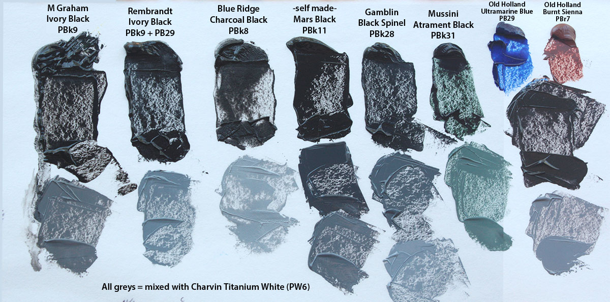
Suddenly, black was everywhere. It caked the flesh of miners and ironworkers; it streaked the walls and windows of industrial towns; it thickened the smoky air above. Proprietors donned black clothing to indicate their status and respectability. New black dyes and pigments created in factories and chemical laboratories entered painters’ studios, enabling a new expression for the new themes of the industrial age: factory work and revolt, technology and warfare, urbanity and pollution, and a rejection of the old status quo. A new class of citizen, later to be dubbed the “proletariat,” began to appear in illustrations under darkened smokestacks. The industrial revolution had found its color.

Black is technically an absence: the visual experience of a lack of light. A perfect black dye absorbs all of the light that impinges on it, leaving nothing behind. This ideal is remarkably difficult to manufacture. The industrialization of the 18th and 19th centuries made it easier, providing chemists and paint-makers with a growing palette of black—and altering the subjects that the color would come to represent. “These things are intimately connected,” says science writer Philip Ball, author of Bright Earth: The Invention of Color. The reinvention of black, in other words, went far beyond the color.