David Lance Goines, from a 1994 interview with Dr. Cece Iandolphi ...
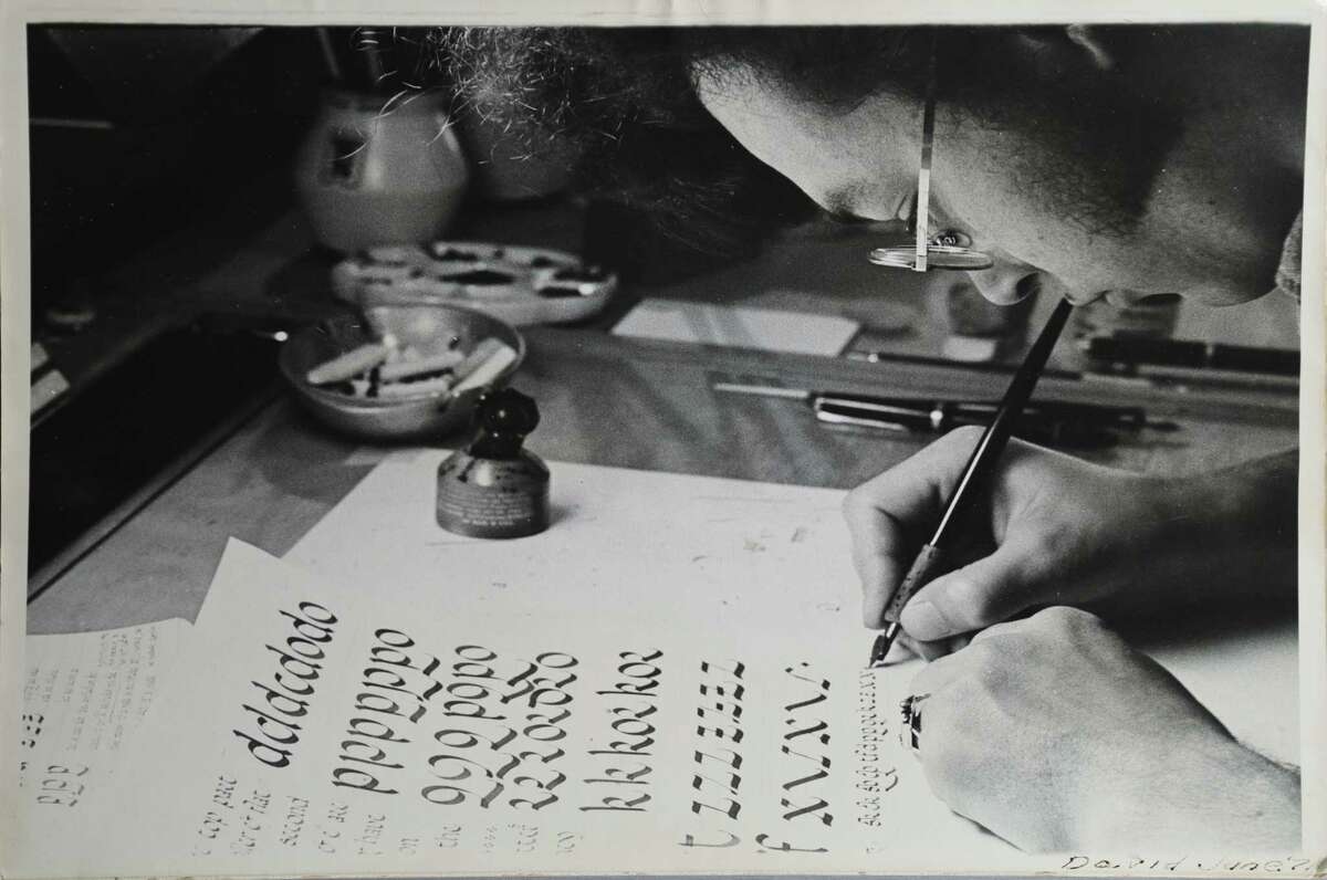
I am of course influenced by everything around me. Everything I see, everything I hear, everything I touch. But there are specific influences, such as Japanese woodblock prints, the German Art Nouveau, the Italian Renaissance.I like a certain look of roughness and irregularity. I do not like clean, sterile perfection. I find a rough line more pleasing, more legible than a clean line. If you were to contrast the typeface Helvetica with Caslon, you would realize that the cleanness and spareness of Helvetica make it harder to read and harder to remember what you have read. With Caslon every letter is different, so you don't have to spend much time deciphering which is which. You read big gulps of words all at once. With Helvetica, they're as much alike as possible, which makes it hard to tell them apart. When you read Helvetica, you slow down because you have to figure out if the letter is a lower case "i" or a lower case "l" and you read almost letter-by-letter. Helvetica looks like it would be easy to read, because it's so simple, but really the more complicated, rough and irregular letters of Caslon win the contest. Things set in Caslon get read; things set in Helvetica get looked at.When you consider a perfect line, or surface and compare it to a rough line or surface, you realize that they bear a different relationship to the real world. A line that's absolutely perfect depends for its appearance on its perfection. If it gets damaged, or dirty, it becomes repulsive. But, a rough line can take the wear and tear of everyday life. A smooth white wall soon becomes disgusting with all the fingerprints and dirt and dings of daily life raining down on it; a brick wall becomes more beautiful with age.


No comments:
Post a Comment